Reimagining reordering.
The original ask
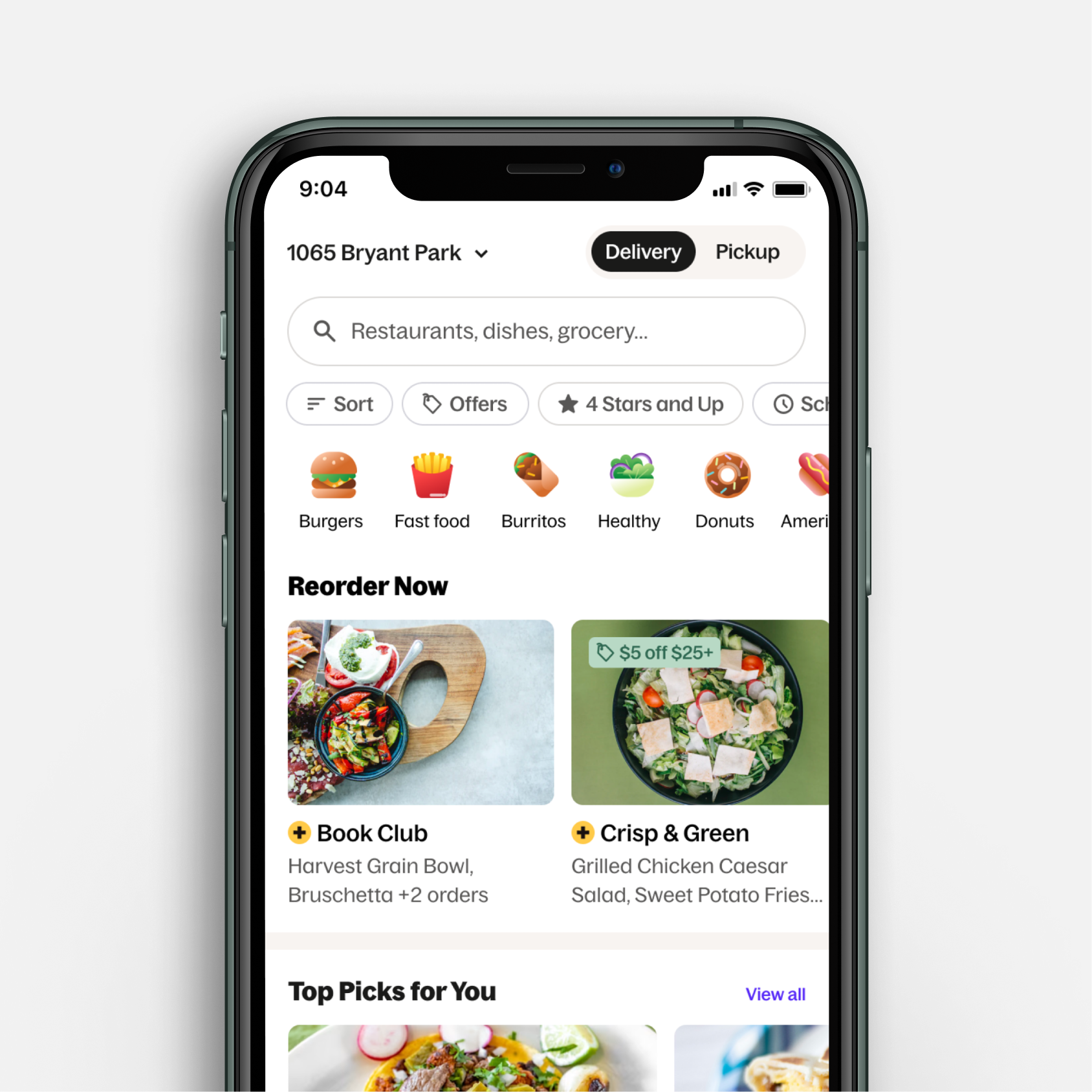
The initial request was straightforward: improve the reorder sheet on the “Recent Orders" topic. Tighten it up, address some known friction points, ship it.
Before I even began to dig in, I knew the ask was only scratching the surface of what actually needed to happen.
Role: Lead (and sole) designer
What I found
Before touching a single screen, I immersed myself in everything we already knew—past user research, competitive audits, behavioral data, and the legacy history of how we got there.
It was clear that reordering wasn't a secondary feature, it was the backbone of Grubhub's most valuable diner relationships. And yet the experience had massive issues:
“Recent Orders" had been temporarily sunset after a broken flow affected 27% of reorder sessions (relying solely on the “In Your Rotation” topic, a merchant-based topic rather than order-based)
Terminology was inconsistent across the app, multiple terms existing in the wild creating confusion and distrust
Tapping a reorder card led to three inconsistent outcomes depending on context (item unavailability, restaurant closures and more)
Closed restaurants and low-rated orders surfaced with no filtering or additional strategy
Express reorder transitions were jarring, and there was lack of clarity between the “Express reorder” action and the “Add to bag” action
Diners with a single past order were shown the reorder topic as if it were meaningful personalization when it really wasn't
The competitive landscape only further confirmed the opportunity. DoorDash and Uber Eats both surfaced reorder topics on home, but neither let diners add items or express reorder directly from that surface. A stand-out experience was there for the taking.
Understanding the diner
One of the most important UXR insights was that diners mentally separated two distinct behaviors: quickly reordering a go-to meal they know and love (Reorder topic) versus revisiting a restaurant they've ordered from before (In Your Rotation topic). These were different intents and we were treating them the same way.
We also learned that diners wanted speed, but not at the cost of feeling uninformed. This is where the research became especially important, because after uncovering these findings, the ask from leadership became pursuing a one-click reorder North Star.
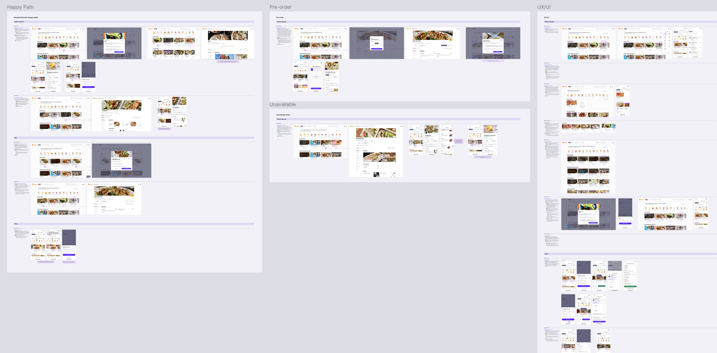
Above is an example excerpt from the comprehensive audit I did for the existing reorder experience.
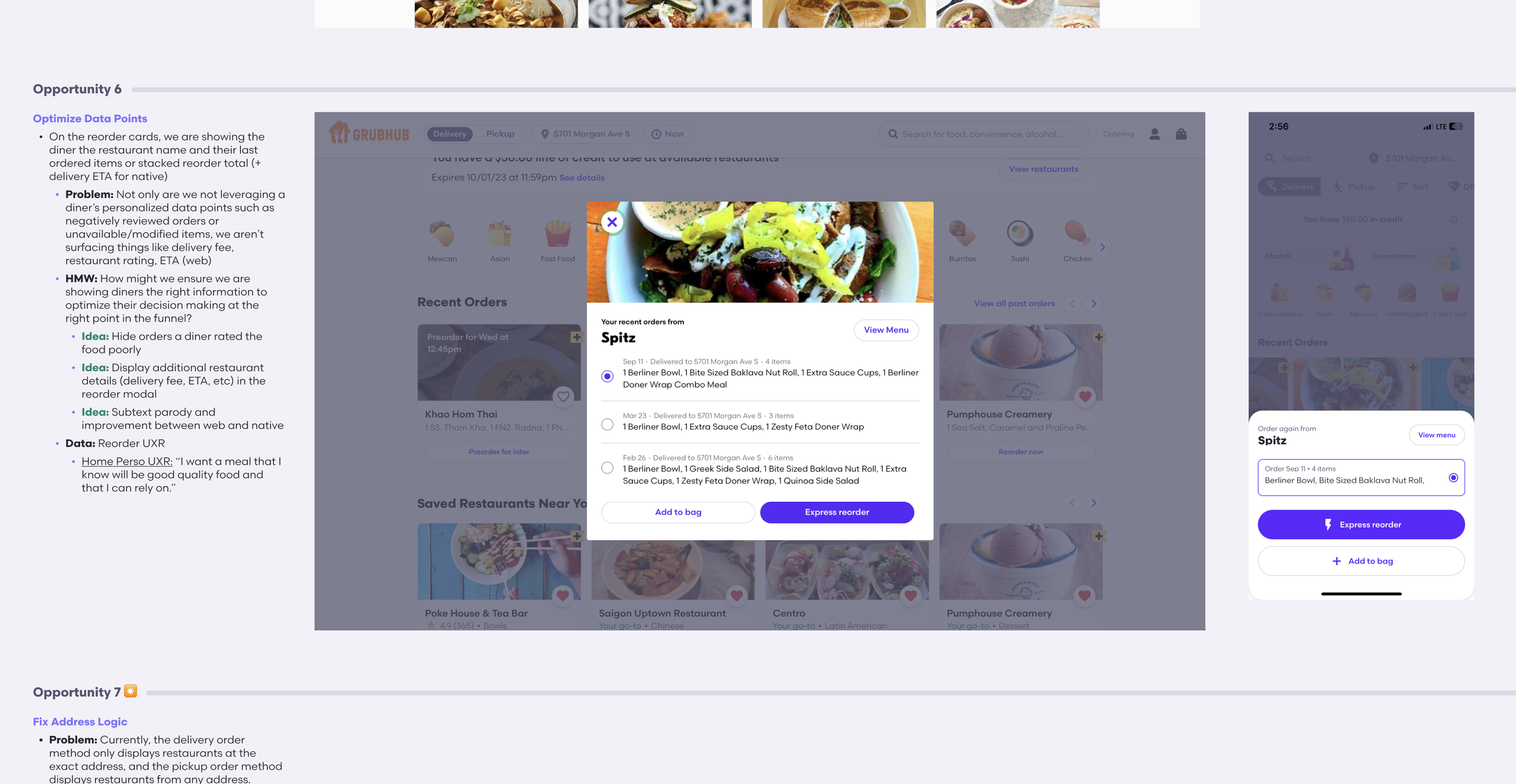
Here is a zoomed in look at one of the identified opportunities from the audit.
Expanding the scope
With all of this in hand, I made the case to go bigger than the original ask. Rather than patching the reorder sheet, I proposed a comprehensive North Star strategy that addressed the experience holistically, across the card, the sheet, the home surface, and the logic driving what diners see and when.
The work organized around four areas of opportunity:
Prioritization:
Show the right orders at the right time. Hide closed restaurants, deprioritize unavailable locations, remove repeating restaurants to surface more variety, and factor in diner ratings to avoid surfacing negative past experiences.
Optimization:
Give diners the contextual information they need upfront and remove the noise of what they don’t. Communicate item unavailability before intent is taken, not after.
Consistency:
One predictable tap behavior for reorder cards. A preorder flow that mirrors the reorder flow. Consolidated terminology across the app.
Visual refresh:
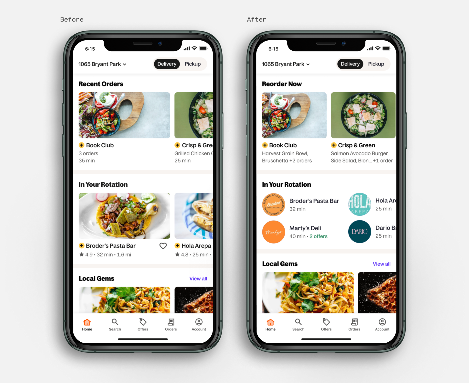
A distinct card shape and layout that breaks from the standard carousel, reducing browsing fatigue and giving reorder its own intentional presence on the home surface.
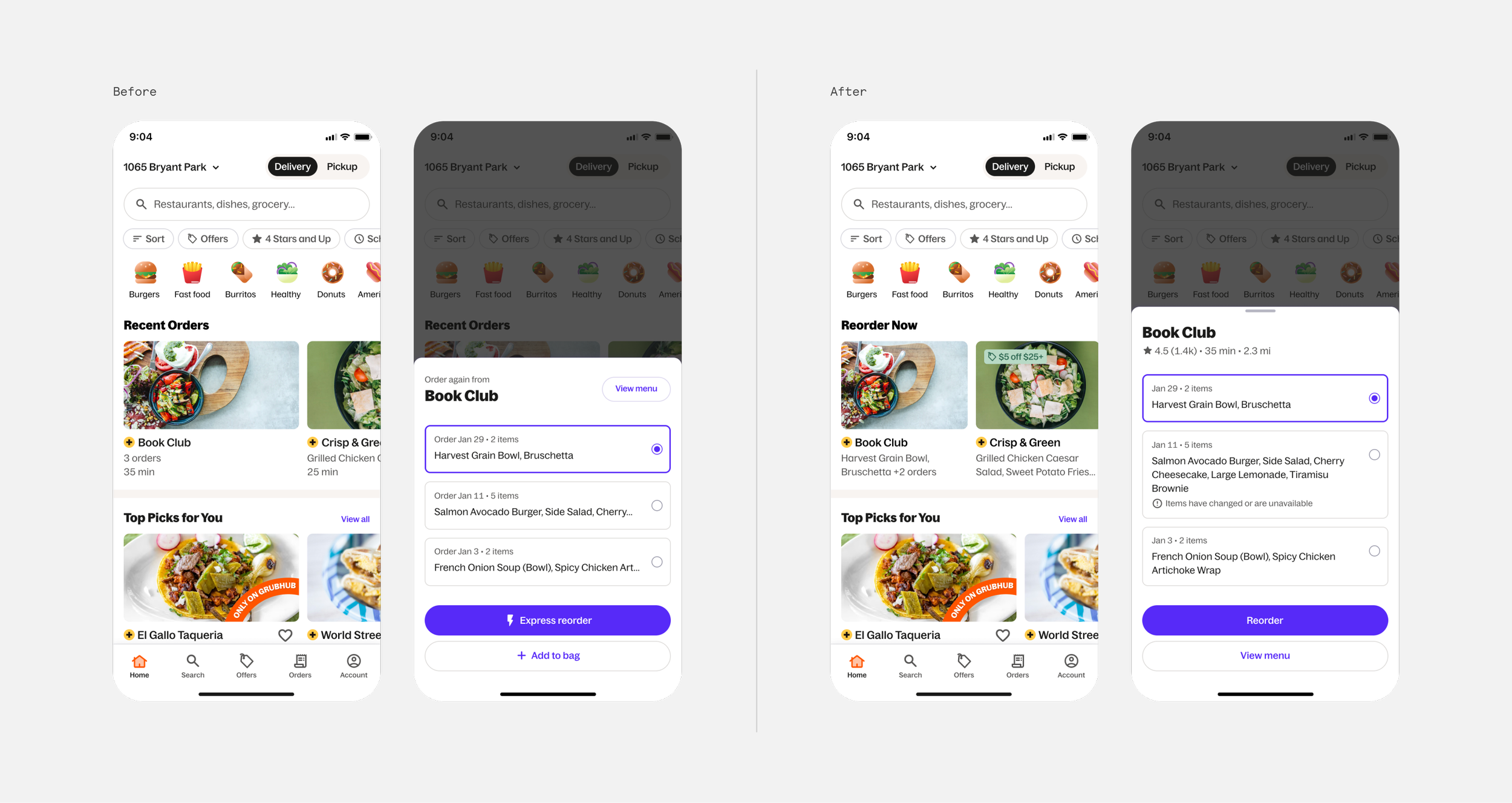
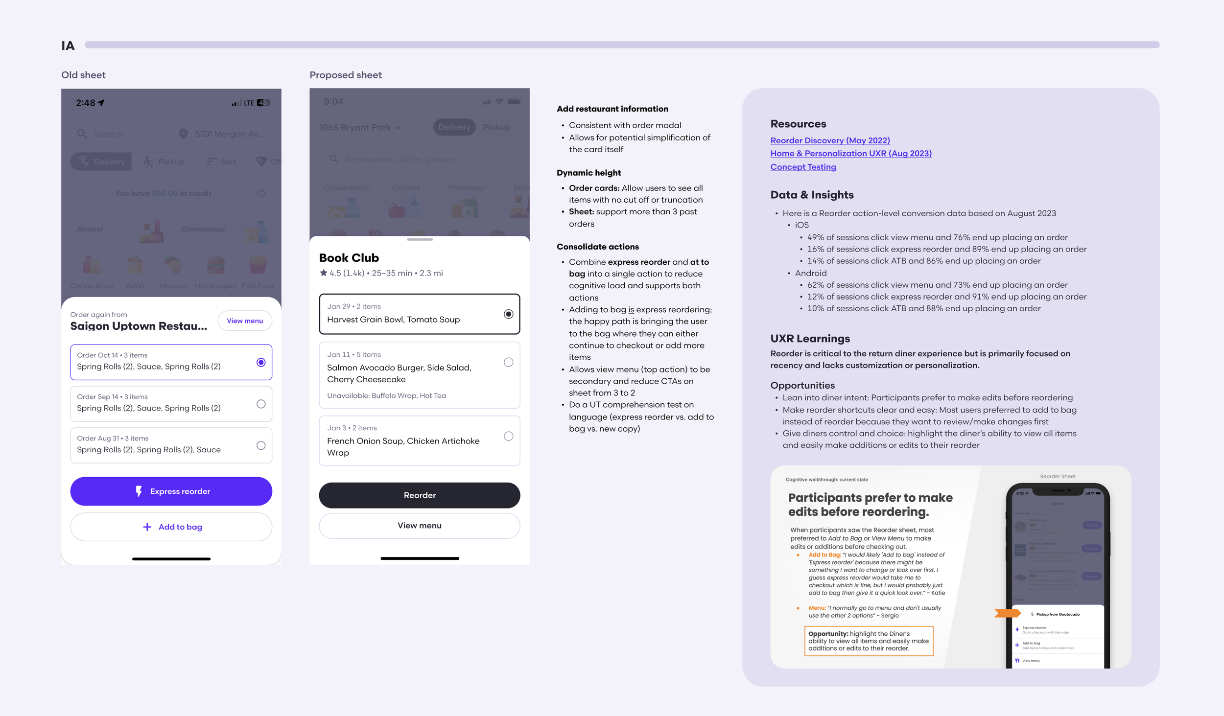
Excerpt from final Figma with breakdown of proposed changes.
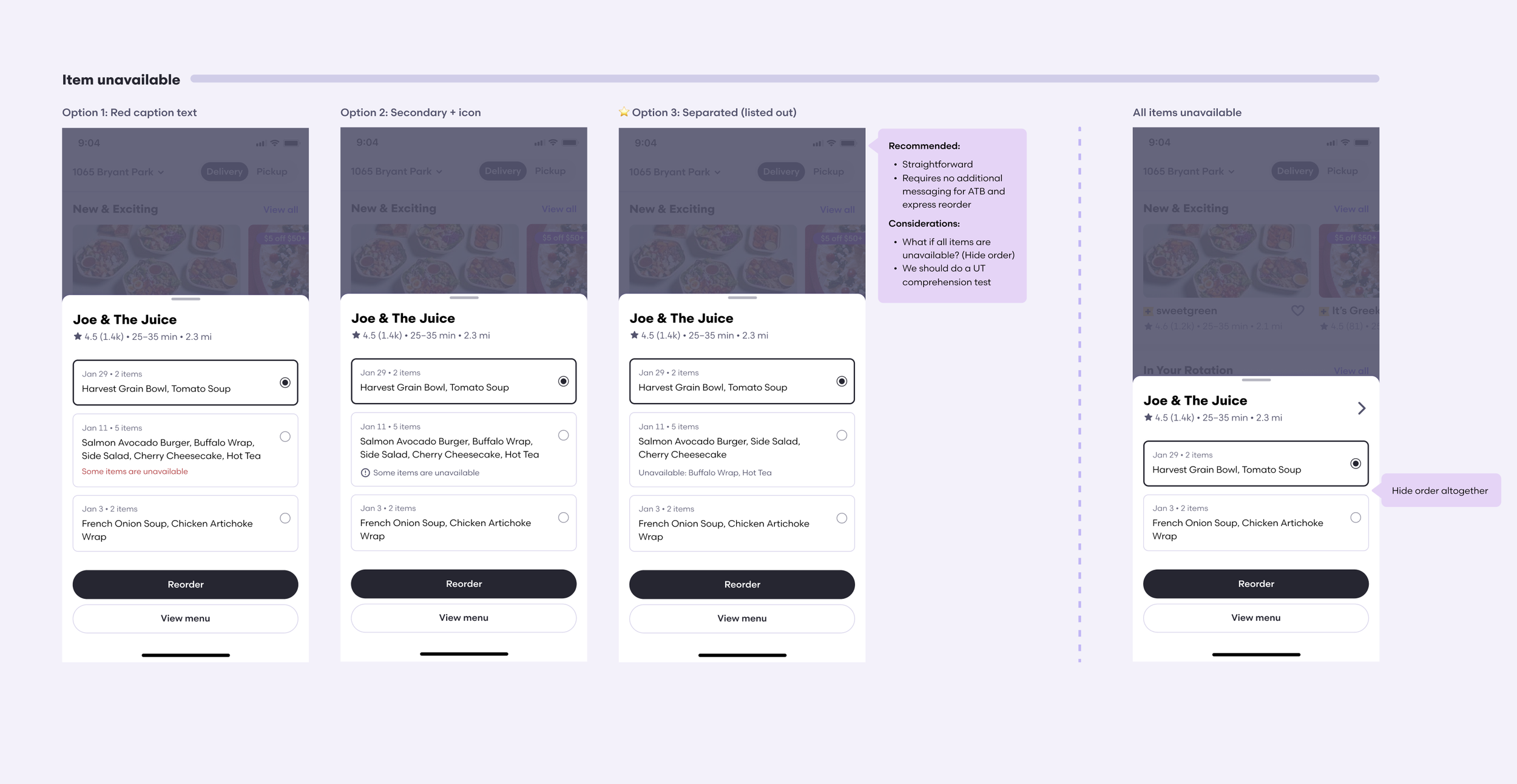
Example of explorational direction for a specific feature affordance from the broader Figma.
Navigating the leadership ask
When looking to the longterm vision, one-click reorder made intuitive sense as a hypothesis—remove all friction, let diners place their go-to order in a single tap, done. It was a real ask that deserved a real answer.
So rather than pushing back outright, I dug into the data to let the evidence make the case. What I found was consistent across every signal we had: diners wanted speed, but they also want to feel in control. One-click reorder ranked at or below 5% desirability even among our most habitual diner segments. Past research only confirmed customers preferred to review an order before placing it. And looking beyond food delivery, even Amazon's “Dash buttons” were sunset and the company had moved away from true one-click purchasing.
The compromise was to design it, test it against my recommended direction, and let diners tell us themselves.
The framework
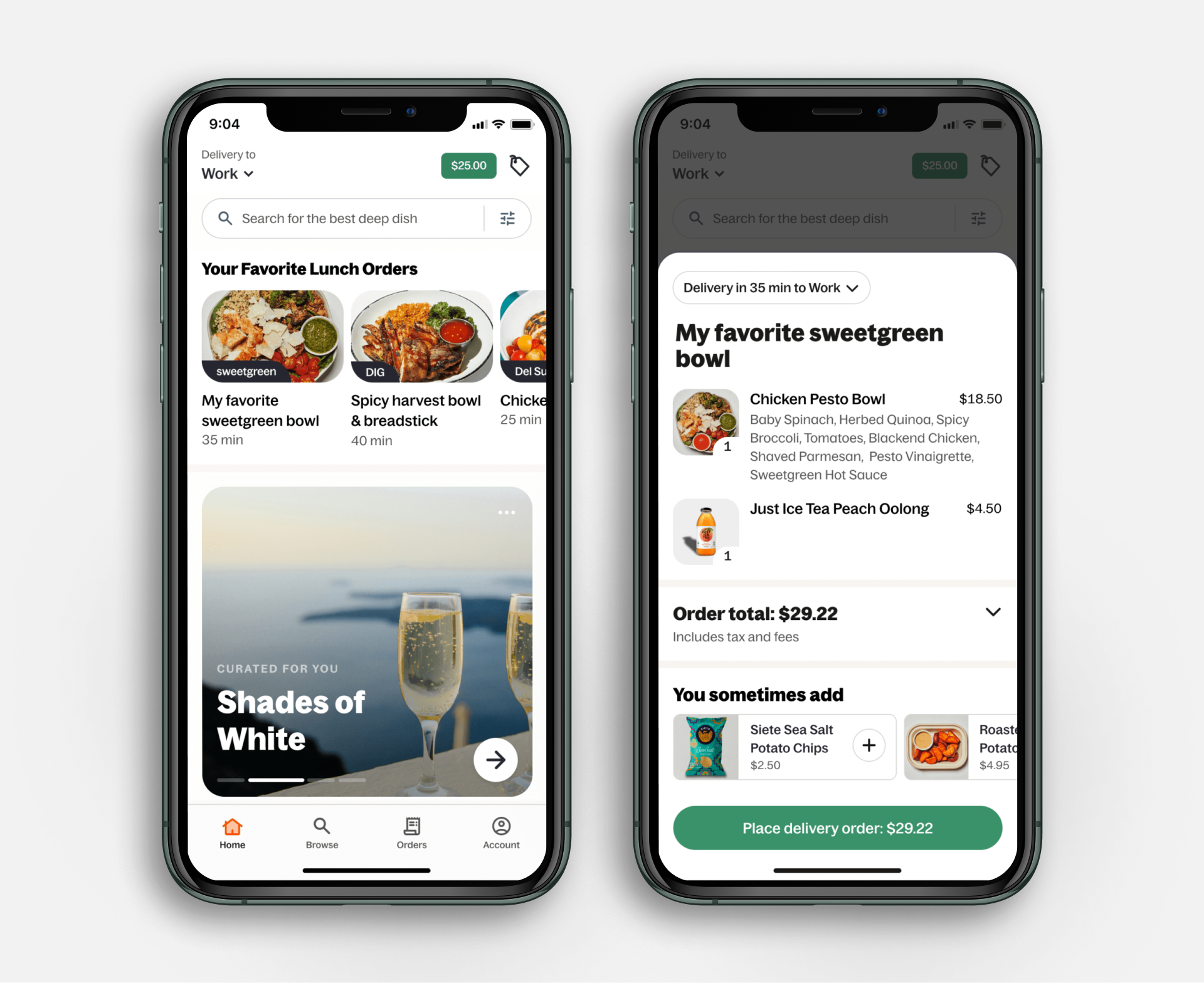
To validate planning for the North Star vision, I moved forward testing two variants:
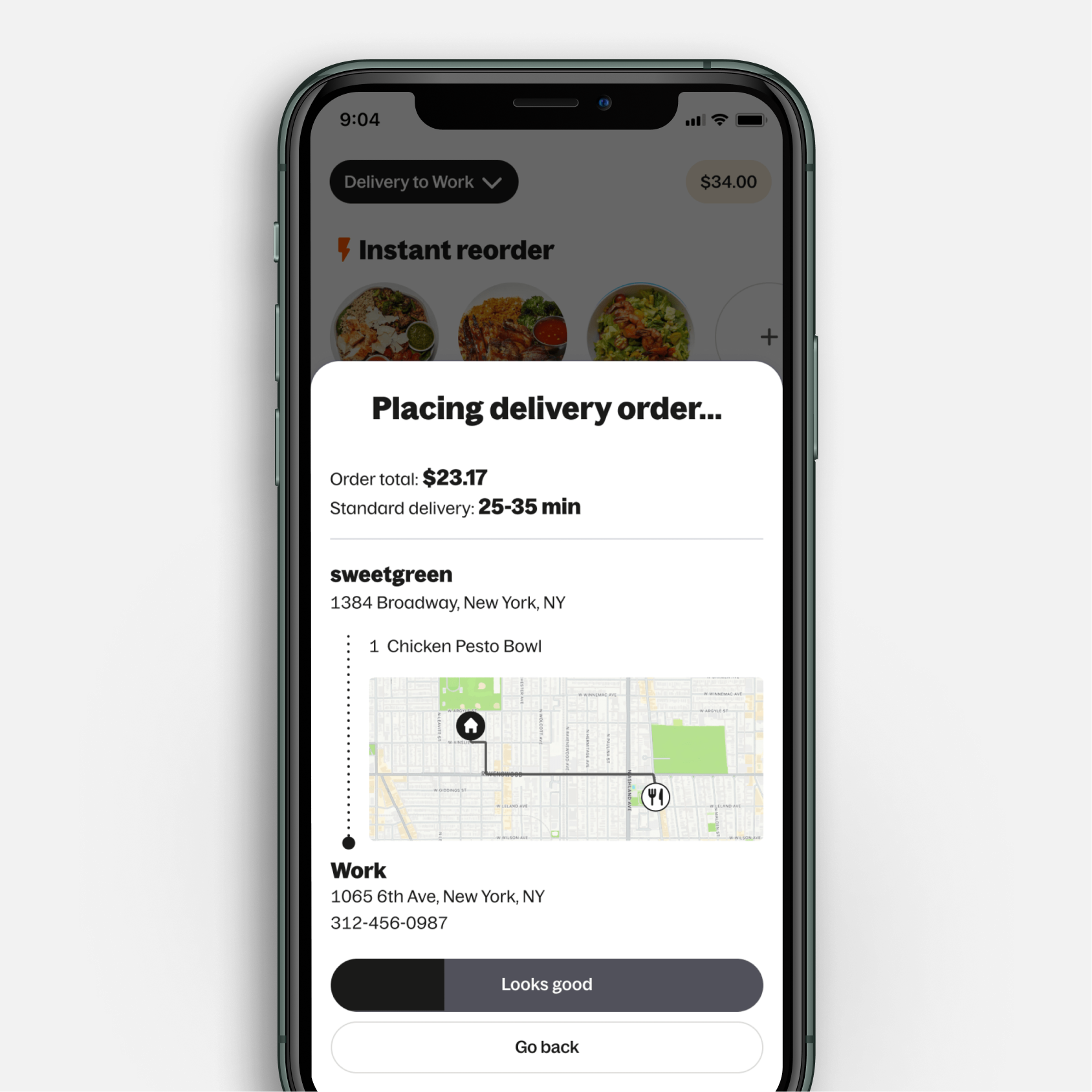
Variant 1: Instant Reorder
The original ask. One tap, maximum speed. Diners consistently told us this wasn't what they wanted—they preferred to review before committing, and the lack of cross-sell opportunity left AOV flat, disproving the initial top-down North Star direction.
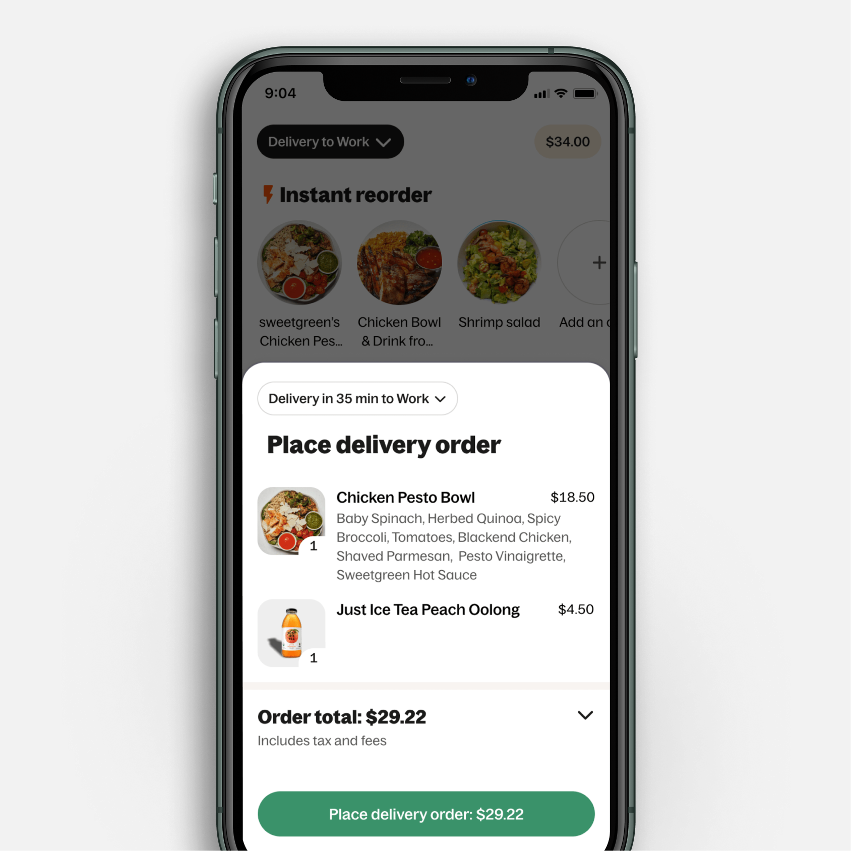
Variant 2: Quick Reorder (Recommended)
Two taps with a lightweight review sheet in between. Fast enough for habitual diners, transparent enough to build trust, and room for thoughtful cross-sells without disrupting the flow.
The North Star
The shipped work was only the foundation. The longer-term vision went further—a meal-focused, visually driven reorder experience that distinguished go-to meals from previously ordered restaurants, surfaced the right reorder based on time of day, location, and diner habits, and weaved in contextual recommendations to bridge habit and discovery.
This project is still in flight with the full North Star being in development planning. But the groundwork is set: a sequenced roadmap that delivers value incrementally while protecting the integrity of the long-term vision.
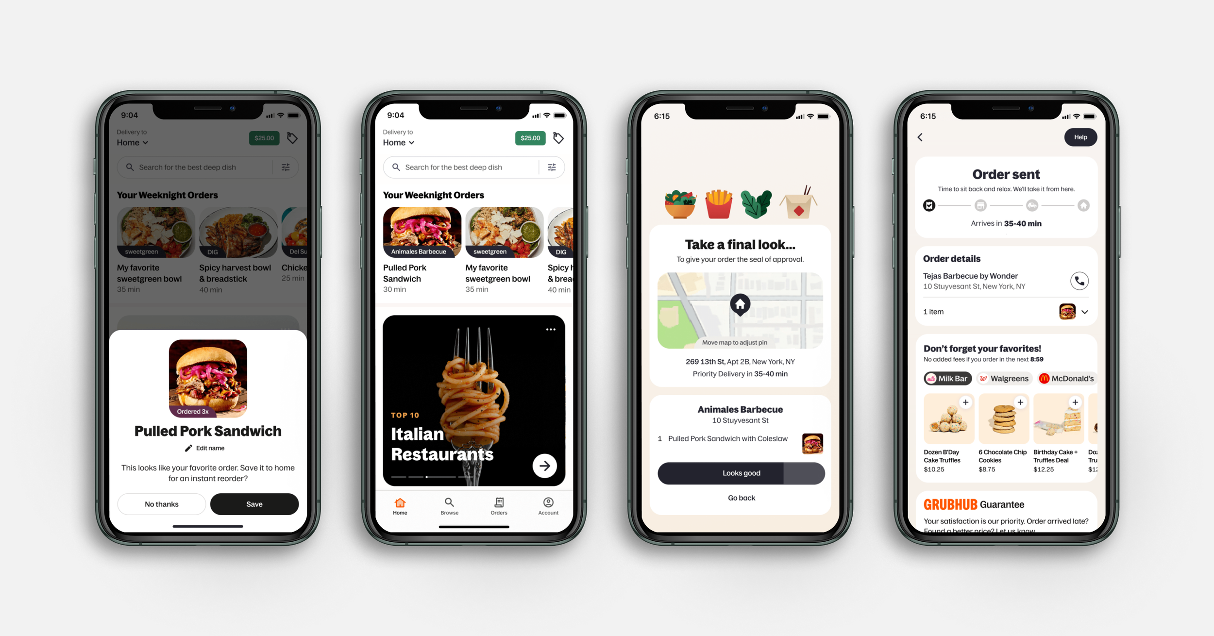
Additional full funnel vision preview.
What I learned
The most valuable part of this project was what happened before diving into Figma. Taking the time to audit, synthesize UXR, and dig into the data completely changed the shape of the work and meant that when I did start designing, every decision had a clear rationale behind it. The original ask was a reorder sheet improvement, but what we actually needed was a strategy, both short and long term.
Navigating the space with limited direction and a lot of ambiguity is an area I thrive in and made the outcome feel that much more worthwhile.
Outcomes
68% of DAGs now represent reorders, over 40% originating from homepage (up from the previous 27%)
Significant improvement in error flows, down to 11.6% (from 32%)
This effort also spurred rethinking our In Your Rotation topic strategy, with the new designs currently being tested.
Next up: Breaking the fatigue, not the habit
The restaurants in a diner's In Your Rotation topic are familiar favorites, but they’ve always been presented visually the same as every other restaurant card on the page. It's the highest performing topic on home with an 18% conversion rate.
Given the familiarity, data points like a large merchant photo, ratings, and distance aren't necessary, and leaning on them makes such a high-performing topic feel like it's just blending in.
Introducing a distinctive visual treatment optimized for context and space pushes us further toward the North Star of a more visually diverse homepage, while leaning into the diner engagement patterns that are already working.